-
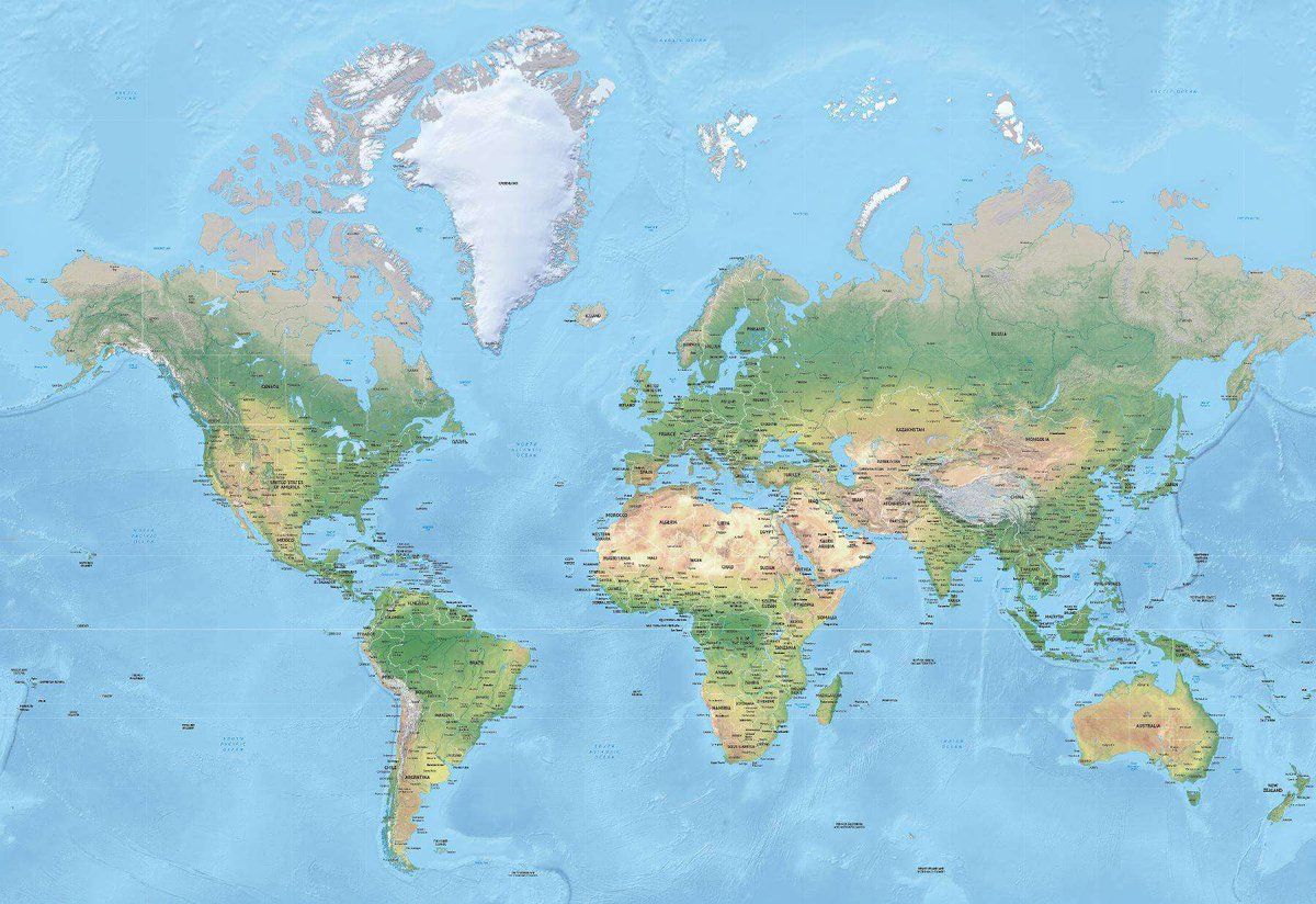
When you look at the most common world map you are looking at a tool for navigation. As a tool for understanding what the world looks like it is awful. When we use tools in any profession we need to understand their limitations. The world map is my go-to example. Thread ->Permalink On twitter.com
 ♻️ 82 Retweets
❤️ 269 Favorites
2021 Dec 5
Mood -1 🙁
♻️ 82 Retweets
❤️ 269 Favorites
2021 Dec 5
Mood -1 🙁
-
…in reply to @axbom
The flat, visual portrayal of the world in two dimensions known as the Mercator Projection is commonplace in classrooms worldwide and often embedded in our unconscious as unquestionable truth. Children are not taught to question it, even by their teachers.Permalink On twitter.com
 ♻️ 1 Retweets
❤️ 41 Favorites
2021 Dec 5
Mood 0
♻️ 1 Retweets
❤️ 41 Favorites
2021 Dec 5
Mood 0
-
…in reply to @axbom
Consider your relationship to the world map. In your head you may use it to think about distances between countries, shapes and sizes of countries and continents. Greenland and Africa look to be essentially the same size. In reality Africa is about 14 times larger than Greenland.Permalink On twitter.com
 ❤️ 37 Favorites
2021 Dec 5
Mood 0
❤️ 37 Favorites
2021 Dec 5
Mood 0
-
…in reply to @axbom
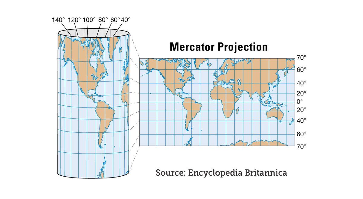
The Mercator projection was presented by Flemish cartographer Gerardus Mercator back in 1569. Its purpose was to be used for navigation and it served this purpose well: throughout the map North is up and South is down, while local shapes and directions are maintained.Permalink On twitter.com
❤️ 34 Favorites
2021 Dec 5
Mood 0
-
…in reply to @axbom
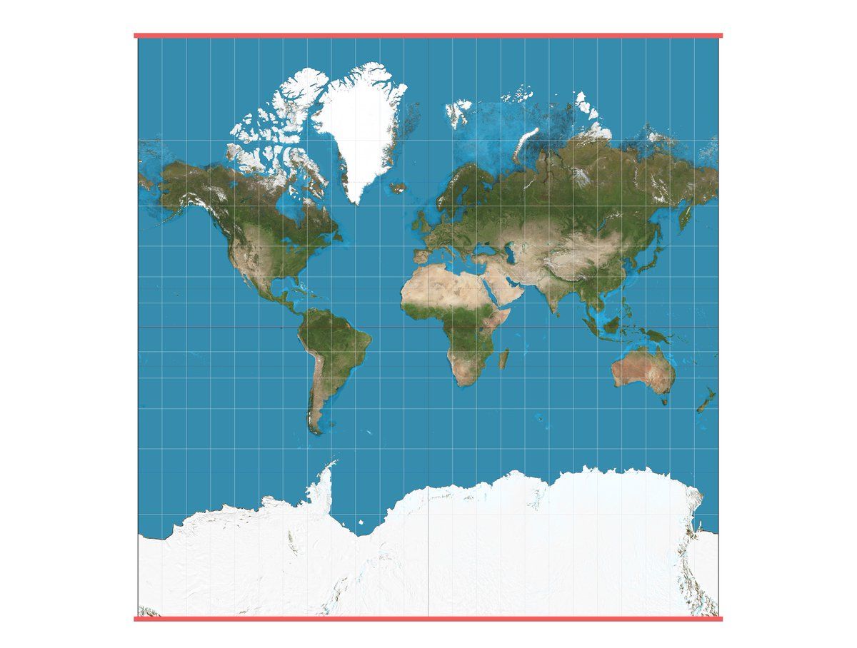
Consider the full Mercator projection including Antarctica (not discovered in 1569). See how long the top and bottom sides of the map are, parallell to the equator. They should be small dots. Those are the poles, where the north and south converge, respectively.Permalink On twitter.com
 ♻️ 1 Retweets
❤️ 30 Favorites
2021 Dec 5
Mood +2 🙂
♻️ 1 Retweets
❤️ 30 Favorites
2021 Dec 5
Mood +2 🙂
-
…in reply to @axbom
What is happening is that the further something is from the equator, the bigger it appears, because it is necessarily stretched out horizontally. The Mercator treats the world as a cylinder rather than a globe. Antarctica is of course nowhere as big as it appears above.Permalink On twitter.com
 ♻️ 1 Retweets
❤️ 32 Favorites
2021 Dec 5
Mood +1 🙂
♻️ 1 Retweets
❤️ 32 Favorites
2021 Dec 5
Mood +1 🙂
-
…in reply to @axbom
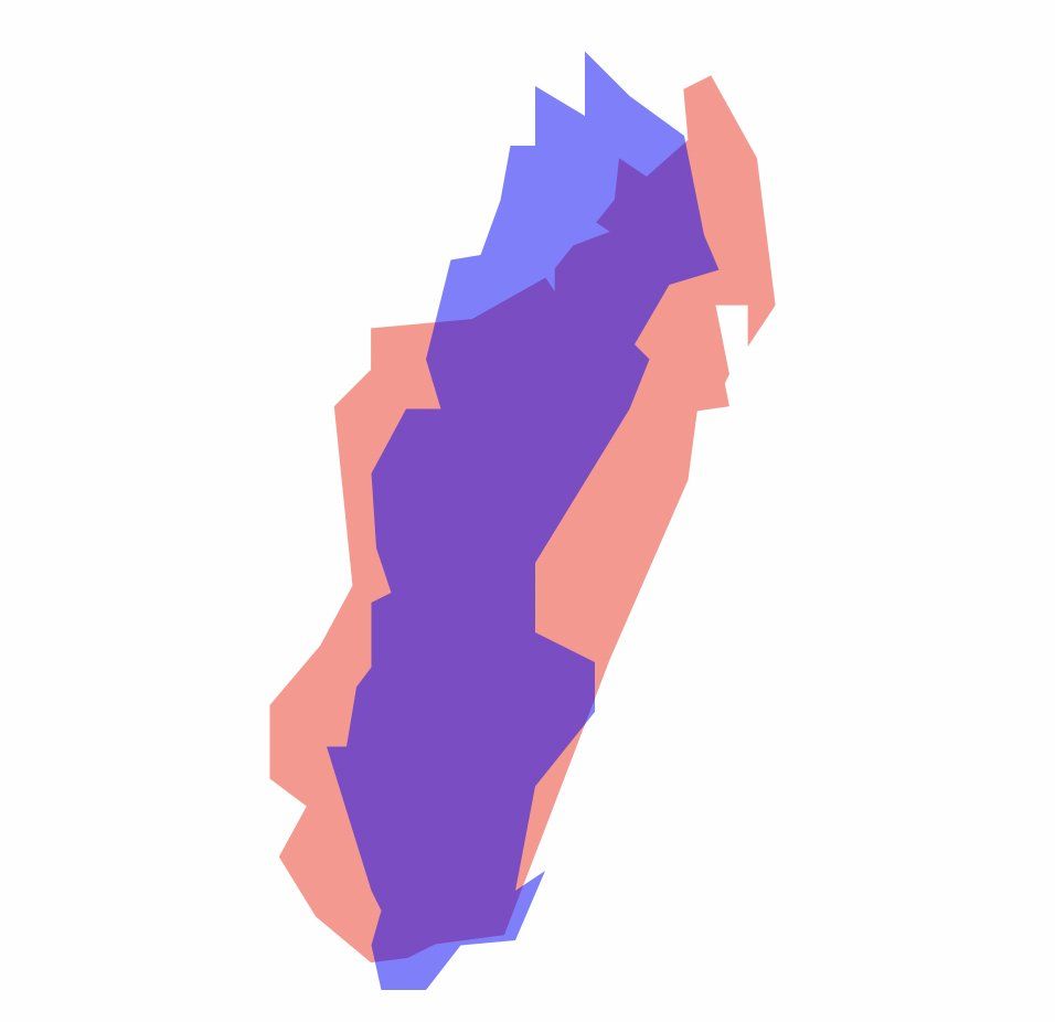
This also means Europe and North America appear much larger in comparison to Central Africa and South America. Another favorite example: On the Mercator projection Sweden appears to be at least twice the size of Madagascar. In reality, Madagascar is 30% larger.Permalink On twitter.com
 ♻️ 3 Retweets
❤️ 36 Favorites
2021 Dec 5
Mood +2 🙂
♻️ 3 Retweets
❤️ 36 Favorites
2021 Dec 5
Mood +2 🙂
-
…in reply to @axbom
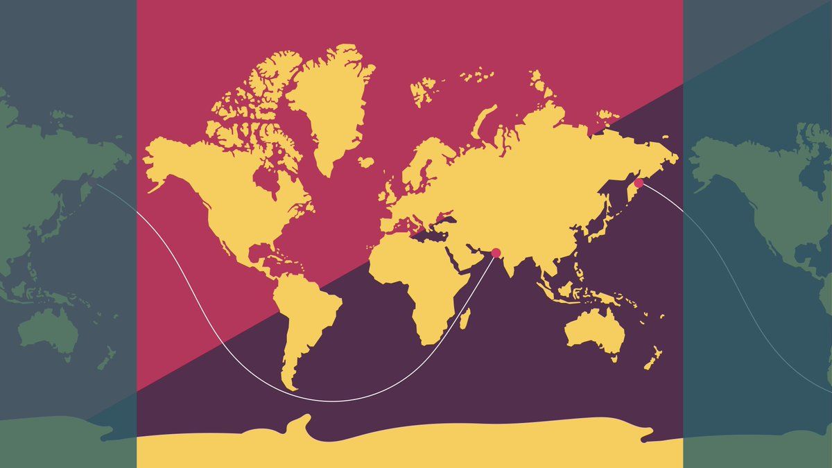
There is another non-intuitive effect of flattening the globe. It's about how the curvature of the Earth is misrepresented. In my talks I show this image of the Mercator projection where a curved line, almost like a sinus curve traverses the map from Pakistan to Russia.Permalink On twitter.com
 ♻️ 4 Retweets
❤️ 37 Favorites
2021 Dec 5
Mood 0
♻️ 4 Retweets
❤️ 37 Favorites
2021 Dec 5
Mood 0
-
…in reply to @axbom
I then ask: what is this line? Most people are naturally stumped by this question. The line represents the longest distance you can sail across the world in a straight line without hitting land. 32,000 kilometres. And yes, you read that right: it's a straight line.Permalink On twitter.com
❤️ 38 Favorites
2021 Dec 5
Mood +3 🙂
-
…in reply to @axbom
The assertion of this being the longest distance in a straight line across water originally came from Reddit user Patrick Anderson (kepleronlyknows) in 2012. It was later confirmed by researchers Rohan Chabukswar and Kushal Mukherjee in 2018.Permalink On twitter.com
❤️ 33 Favorites
2021 Dec 5
Mood +1 🙂
-
…in reply to @axbom
As further evidence here is a video using Google Earth to give you a 3D representation of the line. It becomes immediately easier to accept that it is straight.Permalink On twitter.com
♻️ 5 Retweets
❤️ 62 Favorites
2021 Dec 5
Mood +2 🙂
-
…in reply to @axbom
As a further example of the skewed perspective provided by Mercator, in this video I use thetruesize.com to show how Kenya, a country on the equator, would appear if it was further north or south on the map. The effect of the distortion is extremely clear.Permalink On twitter.com
♻️ 7 Retweets
❤️ 58 Favorites
2021 Dec 5
Mood +1 🙂
-
…in reply to @axbom
Psst. Quick sidenote before the thread is done. If you want to share all the insights in this thread you can share my blog post. I'll keep it updated and clarify stuff there that gets lost on Twitter. axbom.com/world-map/Permalink On twitter.com
♻️ 7 Retweets
❤️ 54 Favorites
2021 Dec 5
Mood 0
-
…in reply to @axbom
By making this the default map in classrooms for centuries, with little context given to the reasons for its appearance, many people have necessarily had a truly twisted view of what the world looks like. Many other projections have been proposed, but not stuck.Permalink On twitter.com
♻️ 1 Retweets
❤️ 33 Favorites
2021 Dec 5
Mood +4 🙂
-
…in reply to @axbom
Identifying the people who claim ownership and ensure distribution may provide a clue to the reason for its persistence. Why would any of the representatives and leaders of the rich, white world want their countries to suddenly appear smaller in favor of poorer countries?Permalink On twitter.com
♻️ 1 Retweets
❤️ 36 Favorites
2021 Dec 5
Mood +4 🙂
-
…in reply to @axbom
Beyond a colonial preference of minimising visual significance of S. America, Africa and India, there are further dilemmas. In a world facing a climate crisis, understanding the interplay of weather and people relies on a firm understanding of the world's systems and structure.Permalink On twitter.com
❤️ 36 Favorites
2021 Dec 5
Mood -2 🙁
-
…in reply to @axbom
Communicating important scientific findings can prove challenging when the majority of the world has a deeply ingrained misunderstanding of the world's appearance.Permalink On twitter.com
❤️ 30 Favorites
2021 Dec 5
Mood 0
-
…in reply to @axbom
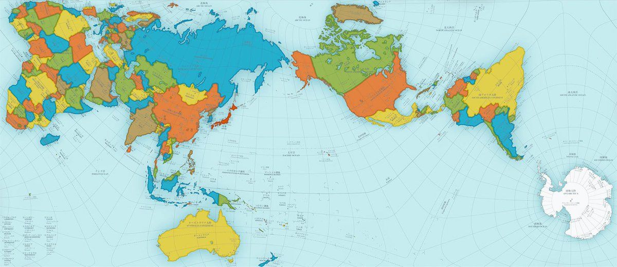
Say hello to Authagraph. I first stumbled upon the Authagraph projection in 2016, but it was invented already in 1999. Japanese architect Hajime Narukawa proposed an innovative approach to mapping. In 2016 it earned him the Good Design Award.Permalink On twitter.com
 ♻️ 6 Retweets
❤️ 60 Favorites
2021 Dec 5
Mood +8 🙂
♻️ 6 Retweets
❤️ 60 Favorites
2021 Dec 5
Mood +8 🙂
-
…in reply to @axbom
The map does a much better job at preserving the relative size and area of land and water masses, while reducing shape distortion. It is also designed to avoid dead ends, allowing the spherical nature of the world to be visualised by simply expanding the map in any direction.Permalink On twitter.com
 ❤️ 27 Favorites
2021 Dec 5
Mood -2 🙁
❤️ 27 Favorites
2021 Dec 5
Mood -2 🙁
-
…in reply to @axbom
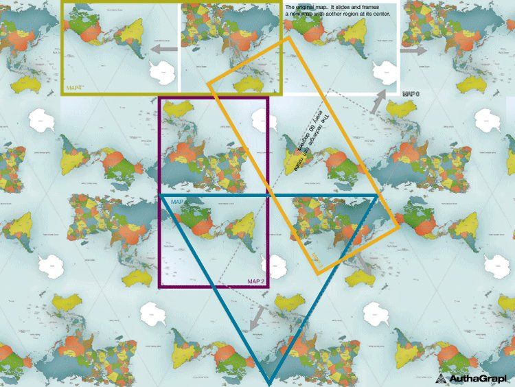
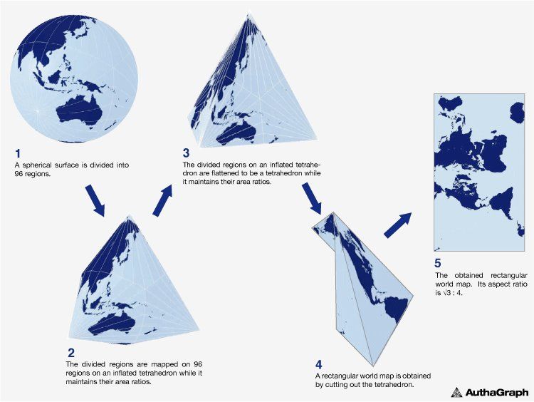
Granted, this map is not perfect (still not a globe) but remains one of the best attempts at representing the world in flat, two dimensions. In this projection, Australia and Brazil suffer the most from distortion. Its tetrahedron roots are explained in this official image.Permalink On twitter.com
 ❤️ 24 Favorites
2021 Dec 5
Mood -1 🙁
❤️ 24 Favorites
2021 Dec 5
Mood -1 🙁
-
…in reply to @axbom
Sadly the Authagraph map is still a proprietary model, and its equations have not been released or published. So it can not easily be reproduced or used in GIS software. This of course has led many people to dismiss it completely, or at least avoid it.On twitter.com
❤️ 25 Favorites
2021 Dec 5
Mood -3 🙁
-
…in reply to @axbom
These are the key learnings my research on maps has brought me: 1. Just because a tool is a huge success for one application does not mean it can be applied indiscriminately for other, seemingly related purposes.Permalink On twitter.com
♻️ 3 Retweets
❤️ 38 Favorites
2021 Dec 5
Mood +3 🙂
-
…in reply to @axbom
2. The longer we use a tool without questioning it, the more of a truth it becomes no matter how wrong it is. 3. We can truly believe we understand a tool without really doing so.Permalink On twitter.com
♻️ 4 Retweets
❤️ 51 Favorites
2021 Dec 5
Mood -3 🙁
-
…in reply to @axbom
4. If we use a tool to navigate but don't understand where the tool is wrong, we can draw all the wrong conclusions and end up in bad places. 5. We need to be always questioning and revising our tools and models to improve them for the purpose we are using them for.Permalink On twitter.com
♻️ 2 Retweets
❤️ 36 Favorites
2021 Dec 5
Mood -6 🙁
-
…in reply to @axbom
6. People will fight to maintain and keep a faulty tool if they appear to gain from it, even if they learn it is wrong. Be wary of tool colonisation efforts.Permalink On twitter.com
♻️ 3 Retweets
❤️ 38 Favorites
2021 Dec 5
Mood -1 🙁
-
…in reply to @axbom
7. Proprietary tools will face a much bigger struggle in gaining traction. If you want to help better the world, open source is your friend. Open source also opens up for incremental improvements through crowdsourcing.Permalink On twitter.com
♻️ 2 Retweets
❤️ 28 Favorites
2021 Dec 5
Mood +6 🙂
-
…in reply to @axbom
Thank you for reading. 😊 If you want to help others change their perspective on maps and tools, everything from this thread - and more - is in my blog post: axbom.com/world-map/Permalink On twitter.com
♻️ 10 Retweets
❤️ 44 Favorites
2021 Dec 5
Mood +8 🙂
-
…in reply to @axbom
To be clear: I'm not suggesting that anyone actually puts a world map in their lap and navigates with that. The Mercator projection is used for local navigation, where it makes sense. The world map is what happened when the same projection was extended to include the whole world.Permalink On twitter.com
❤️ 1 Favorite
2021 Dec 7
Mood +1 🙂
-
…in reply to @axbom
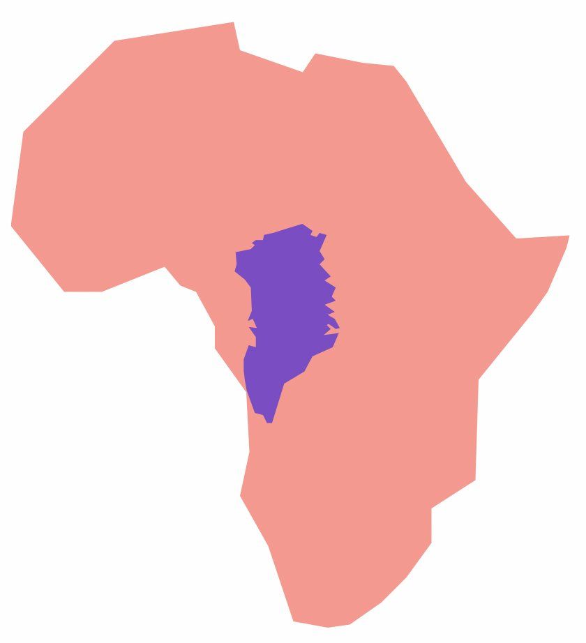
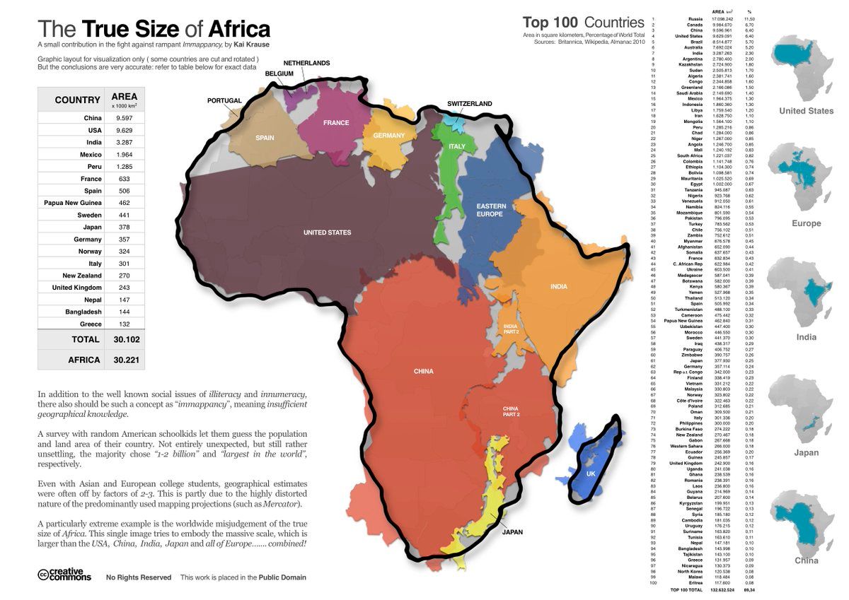
Adding this image to the thread (and post) as it is one of my favorite depictions of the true size of Africa. By Kai Krause. It shows USA, China, Japan, India, Eastern Europe, UK, Spain, France, Germany, Italy, Switzerland and more inside Africa.Permalink On twitter.com
 ♻️ 1 Retweets
❤️ 10 Favorites
2021 Dec 11
Mood +4 🙂
♻️ 1 Retweets
❤️ 10 Favorites
2021 Dec 11
Mood +4 🙂